How to Style a Black, White & Neutral Home, Without it Feeling Cold
The Timeless Appeal of a Black, White and Neutral Home
There’s a reason black, white, and neutral interiors have never gone out of style—they’re timeless, versatile, and just plain chic. But let’s be honest: done wrong, this palette can lean a little cold or impersonal. The good news? With the right styling tips, a neutral-toned home can feel warm, layered, and lived-in—without ever sacrificing that sleek, modern edge.

At Mirra Interiors, we’re all about embracing the beauty of simplicity. A black, white and neutral colour scheme creates the perfect canvas for modern Australian homes—it’s sophisticated but grounded, minimal yet full of soul. Whether your style leans coastal, contemporary or classic with a twist, this palette can be adapted to suit you.
The key is in the detail: texture, tone, contrast and warmth. With thoughtful choices, your space can go from stark to stunning—creating a calm, cohesive vibe that still feels inviting and personal.
Why This Timeless Palette Still Reigns Supreme
Let’s be clear—black, white and neutral interiors aren’t just a fleeting trend. This palette has serious staying power, and for good reason. It’s rooted in classic design principles that just work. The contrast between black and white adds instant definition, while layers of neutral tones bring softness and depth. It’s that perfect blend of structure and serenity.
What really sets this look apart? It’s a total chameleon. Whether you’re styling a minimalist apartment with polished concrete floors or a heritage home filled with ornate mouldings, this palette fits right in. It adapts to your space, your vibe, and your lifestyle—making it a smart choice for anyone who wants their home to feel effortlessly styled and future-proof.
At Mirra Interiors, we love this palette because it creates space to showcase the things that matter—texture, light, shape, and flow. And with the right balance, your home won’t just look styled... it’ll feel like you.
Layering Texture: Your Secret Weapon for a Cozy, Styled Space
If you’re worried your black, white and neutral space might end up feeling a little... sterile—you’re not alone. But here’s the fix: texture, and lots of it. When you’re working with a tight colour palette, texture becomes the main character. It’s what brings your space to life and keeps things from falling flat.
Think: a chunky bouclé sofa you just want to curl up on, a plush wool rug underfoot, or the soft curve of a ceramic vase on your console. Natural timber, linen, marble, matte ceramics, brushed metals—these all add layers of warmth that you can actually feel. Texture taps into the senses in a way colour alone can’t, making your home instantly more inviting.
The beauty of neutral home styling is that it’s not about more stuff—it’s about thoughtful layering. Each element, each material, adds a new dimension that helps soften the space and make it feel lived in, not just styled for a photo.
How to Mix Textures for Maximum Style (and Warmth)
Creating depth in a black, white and neutral home isn’t about adding more colour—it’s about intentionally layering texture. The trick? Play with contrast. Rough vs smooth. Matte vs glossy. Structured vs soft. These little textural juxtapositions add visual interest and stop your space from feeling flat or one-note.

Picture this: a sleek, glossy coffee table styled with a chunky knit throw. Smooth leather dining chairs softened with a draped linen runner. A raw timber bowl perched on polished stone. It’s these kinds of unexpected pairings that give a minimalist space real personality.
When in doubt, lean into natural materials—they bring richness and character to even the most pared-back palette. A few of our favourites for neutral home styling:
- Rattan and wicker for airy, organic texture
- Linen and cotton for soft, casual comfort
- Timber with visible grain patterns for warmth and character
- Stone and concrete for industrial edge with natural variation
- Leather for a rich patina that develops over time
Tonal Variation: The Not-So-Secret Ingredient to a Lush, Layered Space
Let’s bust a myth real quick: styling a black, white and neutral home doesn’t mean sticking to bright white walls and sharp black lines with a bit of grey tossed in. Yawn. The real magic happens when you lean into tonal variation—the subtle shifts in shade and undertone that make a neutral space feel rich, warm, and alive.
Take white, for example. It’s not just “white.” You've got warm ivories, creamy ecrus, cool alabasters, crisp arctic whites—and that’s just scratching the surface. The same goes for black (hello, charcoal, soft black, and onyx) and neutrals like taupe, greige, mushroom, and sand.
Creating Depth Through Tonal Layers
The key to a beautifully styled space isn’t just what colours you choose—it’s how you layer them. Instead of repeating one flat version of black, white, or beige, mix it up with related tones to create what we call colour texture. This adds depth without breaking the minimalist vibe.
Picture a living room painted in a soft, warm white. The sofa’s a textured oatmeal. The throw pillows range from ivory to caramel. A matte black lamp anchors the space while timber or travertine decor adds warmth and movement. It’s all cohesive—but never boring.
One thing to keep an eye on? Undertones. Warm undertones (think yellow, blush, terracotta) create a cosy, cocooning feel. Cool undertones (blue, grey, violet) lend a cleaner, more modern edge. Stick to one undertone family for flow, or use subtle shifts to zone different areas of your home.

When done well, tonal layering makes your home feel considered, not cookie-cutter—and that’s what we’re all about here at Mirra Interiors.
The Bold Elegance of Black: How to Use It with Intention
In a neutral palette, black is the unsung hero. It’s bold yet refined, grounding yet versatile—and when used intentionally, it adds instant sophistication to any space. Think of black as your design punctuation mark. It highlights, defines, and adds contrast without stealing the spotlight.
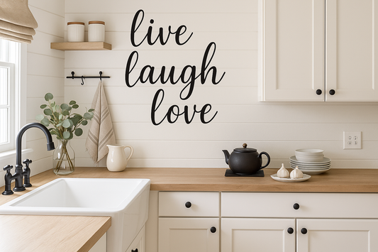
Used thoughtfully, black brings clarity and balance to light and neutral interiors. Black window frames, for example, are like the eyeliner of your home—framing views and architectural details with clean, crisp definition. A black dining table can anchor an open-plan layout, while slim black decor accents can pull a whole room together.

How to Style Black So It Feels Balanced (Not Overbearing)
To make black feel harmonious in your home, spread it throughout your space rather than clustering it in one spot. This creates a visual rhythm that feels curated and cohesive.
🖤 Think black-framed art on white walls, matte black hardware in a creamy kitchen, or a dark statement light fixture above a neutral-toned table. The magic is in the contrast.
Here’s a quick cheat sheet for styling black accents beautifully:
| Element | Impact | Considerations |
| Black Light fixtures | Creates visual punctuation and draws the eye upward | Balance with other black elements at different heights |
| Furniture frames | Defines silhouettes and adds architectural quality | Works particularly well with lighter upholstery for contrast |
| Matte black hardware | Adds definition and refinement to storage elements | Ensure consistency with other metal finishes |
| Art frames | Creates boundaries and emphasizes artwork | Consider varying frame widths for added interest |
Matte finishes tend to feel more relaxed and contemporary (and hide fingerprints—win!), while glossy black adds depth and a touch of drama. Don’t be afraid to mix finishes to create that collected, layered look we love so much.
Bringing Nature In: How Natural Elements Bring It All Together
If you want to soften a black, white and neutral palette and make it feel grounded, natural elements are your best friend. There's something incredibly calming about bringing the outside in—whether it’s a leafy green plant or the warm tones of raw timber. This is what biophilic design is all about: connecting our homes to nature in a way that feels intentional and soul-soothing.
Greenery Is Just the Beginning
Plants are an obvious (and essential) starting point. They don’t just add a splash of green—they add life. From a tall fiddle leaf fig in the corner to a trailing pothos on your shelves, greenery breathes movement and energy into a neutral palette, breaking up hard lines and bringing softness to structured spaces. Bonus: they’re proven to boost mood and air quality.
Not Just Plants: Organic Materials That Add Soul
Greenery is just the beginning. There’s a whole world of natural home decor elements that layer in warmth, texture, and authenticity.
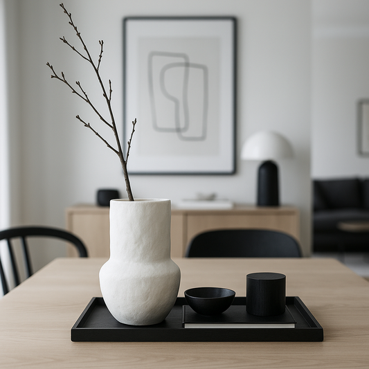
Stone adds another rich layer of texture to your space—organic, grounding, and quietly luxurious. From a marble countertop with bold veining to a travertine coffee table full of character and soft pitting, stone brings a sculptural quality that’s hard to replicate. Even small accents, like a bowl of river stones or a stone candle holder, can add depth and earthiness. Each piece is beautifully unique, with natural markings and tonal shifts that make your home feel layered, elevated, and lived in.
Other natural elements worth incorporating include:
- Timber: Think exposed beams, oak furniture, or even just a beautiful grainy tray styled on your coffee table. Wood feels warm, honest, and timeless.
- Clay and ceramics: Hand-formed pottery pieces bring a beautiful, imperfect texture to shelves and tables.
- Natural-fiber rugs: Jute, sisal, or seagrass underfoot instantly warms up a room and ties your palette together.
- Handwoven baskets: Perfect for storage and style—plus, they showcase beautiful craftsmanship.
- Found objects: Driftwood, shells, or stone curiosities tell a story and connect your home to nature in a way that feels totally personal.
The takeaway? Layering these organic textures into your space doesn’t disrupt a neutral palette—it enhances it. It’s what makes your home feel curated, cosy, and undeniably you.
Lighting: The Unsung Hero of a Neutral Home
In a black, white and neutral space, lighting does more than just help you see—it sets the tone. The right lighting can completely transform your interiors, adding warmth, highlighting texture, and turning what might feel stark into something soft, welcoming, and full of depth.
Because your palette is pared back, light becomes a key styling element. It plays with shadow, reflects off different surfaces, and shifts the way we perceive colour throughout the day. This is where the real magic happens.
The Glow Matters: Warm vs Cool Light
Let’s talk temperature. A warm white bulb (2700–3000K) enhances earthy neutrals and makes everything feel cosy and cocooned. Cooler light (3500–4000K) sharpens whites and brings a crispness to black accents. While both have their place, warm lighting tends to feel more relaxed and flattering in most home settings.
Layered Lighting = Instant Atmosphere
The most beautiful interiors don’t rely on just one overhead light—they layer it. Layered lighting design is all about using multiple light sources at different heights and intensities to create atmosphere, depth, and versatility.
Here’s how to make it work in your neutral home:
- Ambient lighting: Your main source—think ceiling lights, recessed lighting, or clean-lined wall sconces that softly fill the space.
- Task lighting: Adds function where you need it most. Try pendant lights over a kitchen bench, a reading lamp beside the sofa, or under-cabinet strips in the kitchen.
- Accent lighting: For spotlighting architectural features, artwork, or even a beautiful textured wall. Think picture lights or subtle uplighting.
- Decorative lighting: Statement pieces that double as decor—sculptural pendants, arched floor lamps, or ceramic-based table lamps that tie in your palette and textures.


Lighting isn’t an afterthought—it’s one of the most impactful tools you have for making a neutral space feel elevated and lived-in. And when it’s done well? Pure magic.
Adding Soul to a Neutral Space: Make It Yours
The most beautiful black, white and neutral homes aren’t just well-designed—they’re deeply personal. They tell a story. Without those lived-in touches, even the most Pinterest-perfect space can feel a little like a showroom: stylish, yes—but missing soul.
What brings a neutral space to life is you. Your collections, your memories, your story. Think travel mementos, heirloom pieces, ceramics picked up from weekend markets, or even that quirky object you just love for no good reason. These don’t have to be colourful to stand out—monochrome or natural-toned objects can still create incredible impact through texture, shape, and meaning.
Art, Books & Objects With Meaning
Art is one of the easiest ways to personalise your space within a muted palette. Black and white photography, minimalist line drawings, etchings, and abstract neutrals all add visual interest and emotional connection. Curate a gallery wall with a mix of frames and media, or let a single oversized piece steal the show.


And don’t overlook your books—they’re powerful design tools in their own right. Stripped of their dust jackets, books often reveal beautiful, tonal spines that complement neutral interiors. Stack them on coffee tables, float them on shelves, or pile a few favourites on your bedside—whatever feels true to you.
In the end, the most compelling homes aren’t overly polished or perfectly styled—they feel lived-in, layered, and completely your own. Let your home reflect your values, your travels, your favourite textures and stories. That’s what turns good design into something unforgettable.
Creating Visual Interest Through Contrast
When you're styling a black, white and neutral home, contrast is everything. It’s what keeps your space from falling flat, adding rhythm, structure, and visual intrigue. And while the contrast between black and white is the most obvious, there are so many more layers to play with—texture, scale, shape, and style all contribute to a space that feels dynamic and thoughtful.
Design Tension That Works
Some of the most eye-catching interiors are built on clever juxtapositions. Try pairing:
- Sleek modern furniture against ornate, traditional architecture
- Geometric patterns layered with soft, organic curves
- Rustic finishes like raw timber or rattan with smooth marble or ceramic
- Handcrafted artisan pieces alongside clean-lined, mass-produced items
This kind of design tension makes a room feel collected and lived-in, rather than too “matchy-matchy” or one-note.
Make a Statement With Focal Points
Every room benefits from a focal point—an element that immediately draws the eye and anchors the space. In a monochromatic setting, contrast becomes your primary tool for creating these focal points. A black accent wall behind a white bed, for instance, creates a dramatic backdrop that frames the furniture and defines the sleeping area.
Every room needs a moment—something that pulls you in and anchors the space. In a neutral palette, contrast becomes your go-to tool for creating those focal points.Think:
- A black accent wall behind a creamy linen bed
- A sculptural white vase styled against a dark timber console
- A woven pendant over a minimalist kitchen island
Even the negative space (those intentional blank areas) plays a role. In minimalist styling, space is the statement. It gives your eye a moment to rest and makes your focal points feel even more deliberate.
And remember—contrast isn’t just about colour. A large, smooth white vase next to a cluster of rough black stones? That’s contrast in scale, texture, and tone all working together.


A Note on Kitchens
Your kitchen is the perfect place to elevate contrast with natural touches. Open shelves let you showcase texture-rich items like:
- Timber cutting boards
- Woven pendant lights
- Handmade ceramics
- Potted herbs that are as pretty as they are practical


Add in warm, layered lighting—especially under-cabinet options—to eliminate harsh shadows and bring softness to the space.
Contrast doesn’t mean chaos. When done right, it creates harmony through difference—and that’s what makes neutral interiors feel curated, not cold.
Styling for the Seasons: The Quiet Power of a Neutral Palette
One of the most underrated perks of a black, white and neutral home? It adapts beautifully with the seasons. With a timeless, monochromatic base, you don’t need to overhaul your space every few months. Instead, subtle shifts in texture, tone and accessories allow your interiors to reflect the mood of the season—cool and cosy in winter, breezy and light in summer.This seasonal flexibility is what makes neutral interiors so effortlessly livable. Your foundation stays classic, while the atmosphere evolves with just a few thoughtful updates.
How to Transition Your Space Year-Round
Autumn
Welcome in warmth with textured neutrals—think wheat-toned throws, dried grasses in ceramic vases, and amber or cognac glassware that echo the season’s golden tones.
Winter
Layer up. Swap out lighter fabrics for chunky knits, velvet or wool throws, and faux fur cushions in rich, grounding shades. Bring in brass or bronze accents for a bit of reflective warmth. Even switching a white slipcover to oatmeal or greige can transform the vibe.
Spring
Lighten the layers—both literally and visually. Replace heavy textiles with cotton or linen, introduce botanical touches (fresh or printed), and play with subtle pattern through tonal stripes or soft, organic shapes. A few new cushions or even a simple vase of branches can make the whole space feel refreshed.
Summer
Keep it airy. Embrace negative space by decluttering surfaces and opting for lightweight curtains that dance in the breeze. Roll out natural fiber rugs, swap darker ceramics for glass or stone, and keep things feeling open, calm, and sunlit.No matter the time of year, your neutral palette provides a flexible canvas to layer, edit, and evolve—creating a home that always feels fresh, grounded, and in tune with the season.
Budget-Friendly Ways to Style a Black, White & Neutral Home
Let’s bust a myth: you don’t need a massive budget to create a beautiful, monochromatic space. In fact, the beauty of a black, white and neutral home is that its sophistication comes from intentional styling, not big-name brands or expensive materials.Because the palette is pared back and cohesive, it actually makes thrifting, upcycling, and DIY projects way easier—and more effective. A dated timber chair becomes a statement with a fresh coat of chalk paint. A collection of mismatched ceramics suddenly looks curated when styled together in similar tones. These thoughtful edits add character and patina, keeping your space feeling warm, not clinical.
Spend Smart, Style Well
If you're working with a limited budget, put your money where it matters most—anchor pieces like:
- A well-constructed neutral sofa in a durable fabric
- A quality natural fiber rug to ground your space
- Lighting that’s both functional and a feature in its own right
Around these investments, you can layer in affordable finds that still elevate your aesthetic—think vintage glassware, pre-loved side tables, or handmade decor from local markets.
Paint: Your Budget’s Best Friend
Few things are as impactful—or affordable—as paint. Here are a few ways to use it strategically in a neutral home:
- Refresh old furniture with warm white or soft black chalk paint
- Paint kitchen cabinets to give your space an instant facelift
- Create contrast with a black feature wall (you’ll use less paint, too)
- Update old tiles using tile-specific paint in creamy tones or matte white
DIY Textile Hacks That Work
No sewing degree required—DIY textiles are an easy way to personalise your space without spending big. Try:
- Overdyeing colourful pillows or curtains with tea or coffee for a soft, earthy beige
- Using fabric paint to add tonal patterns to plain white cushion covers
- Mixing textures (linen, cotton, boucle) to create richness on a dime
One of the best parts of a neutral palette? Even your amateur projects can look effortlessly chic. This aesthetic doesn’t demand perfection—it’s about warmth, intention, and creating a home that reflects you.
Common Pitfalls to Avoid in Neutral Styling
Even the most well-intentioned neutral spaces can fall a little flat if a few key elements are overlooked. A black, white and neutral palette may look effortless, but behind every balanced, lived-in space is a careful eye—and a few lessons learned. Here’s what to watch out for when designing your own monochromatic dream home.
The “Layer Cake” Trap
One of the most common styling mistakes is creating what designers call a "layer cake" effect—stacking alternating black and white elements in a rigid, high-contrast pattern. While contrast is powerful, this kind of overly structured styling can feel forced. Instead, let neutral tones act as bridges between black and white. Think soft greige walls with black frames and warm timber accents—it’s about flow, not formula.
Poor Lighting = Flat Spaces
Monochrome interiors rely on shadows, highlights, and subtle shifts in tone to feel rich and dimensional. Without thoughtful lighting, things can look dull or washed out. Make sure you layer your lighting—ambient, task, accent—and use warm bulbs with a high CRI (90+) to properly show off your textures and tones.
Everything Matching Too Much
When every piece looks like it came from the same showroom, a space can start to feel corporate or soulless. Instead, mix materials and finishes, play with vintage and new, and allow for a little asymmetry or imperfection. Your home should feel curated, not copied.
Ignoring Scale
In a restrained palette, scale does the heavy lifting. Without colour to draw the eye, visual interest needs to come from the mix of shapes and sizes. Pair oversized artwork with fine-line decor, tall vases with low bowls, and substantial furniture pieces with airy accents. The contrast in proportions adds just as much energy as colour ever could.
FAQs About Styling a Black, White & Neutral Home
1. How can I make my black, white and neutral kitchen feel warm and inviting?
Neutral kitchens are the perfect canvas for layering in warmth and texture. Incorporate natural elements like timber cutting boards, woven pendants, and textured ceramics to add soul and soften sleek finishes. Open shelving is a great way to showcase these pieces while keeping things airy and curated. Don't forget greenery—fresh herbs or a trailing plant can breathe life into your space. And when it comes to lighting, warm-toned bulbs and under-cabinet lighting can make all the difference, eliminating harsh shadows and adding cosy ambience.
2. Is it possible to have children and pets in a black, white and neutral home?
Absolutely—neutral doesn’t mean impractical. Choose performance fabrics that are stain-resistant and durable. Warmer off-whites or textured upholstery are more forgiving than bright whites. Machine-washable slipcovers, pillowcases, and throws are your best friends. Embrace subtle tonal patterns that help camouflage wear and tear—and remember, a little patina adds charm. A beautiful home should feel lived in, not showroom-perfect.
3. How do I prevent my black, white and neutral bedroom from feeling too stark?
Bedrooms thrive on texture and softness. Start with layered bedding—mix materials like linen, cotton, and velvet for that lived-in luxury feel. Add depth with a tufted headboard, textured cushions, and a plush rug underfoot. Window treatments in natural fibres add both comfort and privacy. For added dimension, consider a feature wall in grasscloth, wainscoting, or a subtle textured wallpaper—it creates warmth without overwhelming the palette.
Conclusion: The Beauty of a Black, White & Neutral Home
Designing with a limited palette isn't about playing it safe—it’s about elevating the details that matter. In a black, white and neutral home, every choice carries weight. You notice the grain in a timber table, the way linen drapes in soft light, the curve of a ceramic vase, the gentle play of shadow on a textured wall. With restraint comes clarity. And with clarity comes calm.
This approach to styling invites us to slow down. To curate with purpose. To choose pieces that mean something—whether they’re heirlooms, handcrafted finds, or DIY projects made on a budget. It’s not about filling a space, but letting the space breathe.
Throughout this blog post, we’ve explored how to layer texture, use contrast thoughtfully, personalise your space, embrace seasonal shifts, and avoid the common pitfalls that can flatten a neutral design. The result? A home that feels timeless, tactile, and unmistakably yours.
In a world that’s constantly demanding more—more colour, more noise, more clutter—a monochromatic space becomes a sanctuary. A place to reset. A place to live, reflect, and exhale.
Because at the end of the day, the beauty of this palette isn’t just in what it shows—it’s in what it allows you to feel.